Thursday 2 November 2017

The People's Pier - RIBA Stirling Prize 2017

Creating a legacy, Hastings Pier, Image from dRMM

This year's RIBA Stirling Prize has been awarded to dRMM - led by Architects Alex de Rijke, Philip Marsh and Sadie Morgan for their project, Hastings Pier.

The Stirling Prize identifies the UK's best new building, each year, it is now in it's 22nd year. Past winners of the award include Caruso St John Architects, AHMM, Haworth Tompkins and Stanton Williams to name a few examples! Each practice is well established in their own right, with a portfolio of successful projects to be proud of.

The judging criteria includes design vision, innovation, originality, capacity to stimulate, engage, delight occupants/visitors, accessibility, sustainability, client satisfaction and how fit the building is for it's purpose.

The nominees for this year are:

Barretts Grove by Amin Taha + Groupwork for Nick Grant, Image from Dezeen.com


The British Museum World Conservation and Exhibitions Centre
by Rogers Stirk + Partners for the British Museum, Image from archdaily.com
 

City of Glasgow College - City Campus by Reiach and Hall Architects 
and Michael Laird Architects for City of Glasgow College, 
Image from architectsjournal.co.uk 


Command of the Oceans by Baynes and Mitchell Architects
for Chatham Historic Dockyard, Image from dezeen.com

Hastings Pier by dRMM for Hastings Pier Charity,
Image from architectsjournal.co.uk

Photography Studio by 6a architects for Juergen Teller LTD, Image from 6a Architects

The Hastings Pier originally opened in 1872, it was closed to the public in 2006 over fears of safety and it was largely destroyed by a horrific fire in 2010. Hastings Pier Charity invited a host of architects to submit designs for a redevelopment of the once attractive structure.

A neglected piece of history, image from http://www.urban75.org/blog 

dRMM won the design competition and began a collaboration with the charity, which lasted 7 years. A crowdfunding campaign raised £590,000 towards the £14.2 million restoration project, whilst the remainder of the funds came from the Heritage Lottery Fund. The crowdfunding element is particularly interesting, as this is what urged the title of the People's Pier to the project, the community has a sense of ownership over the redevelopment. 

The Pavilion, Image from archdaily.com

The deck, Image from dRMM
  
The Pier has been transformed from a ruin, a century-old pier, into a beacon of community spirit and a flexible community space. The layout consists largely of an empty deck with a small pavilion at the centre and a staircase leads onto the rooftop. There is a sympathetic quality to the details of the project, reclaimed timber planks from the original deck have been used to clad the pavilion in a diagonal pattern. Remaining timbers were used to create furniture as part of a local employment initiative.


Old and New, Image from architectsjournal.co.uk 

The Pavilion has been placed at the centre of the deck, as opposed to the end, the Pavilion is a mere element of a larger concept. This is a celebration of old and new, the original iron structure stands at the edge of the pier, to be admired.


Enjoy the view, Image from architectsjournal.co.uk

The form of the pier is not without great function, the large protruding deck is a stage to an endless amount of possibilities for "relaxation, contemplation and play", as quoted by Maria Ludkin from Hastings Pier Charity. It's a 21st Century solution for a seaside town, in need of regeneration.


To finish, here is a short film released by the AJ, in conversation with dRMM's Alex de Rijke:


Sunday 2 July 2017

Serpentine Pavilion 2017 - Diébédo Francis Kéré


The Serpentine Pavilion 2017, designed by Burkinabe Architect 
Diébédo Francis Kéré, own photographs. 
This years structure has been commisioned by Kéré, the 17th Architect to do so. In previous years pavilions have been designed by BIG, Sou Fujimoto, Herzog and de Meuron, Peter Zumthor and Jean Nouvel. The pavilions are erected every summer outside the Serpentine Gallery.

The pavilion is an oval form reminiscent of a tree,
with a blue wall enclosing the space beneath it
The rich tone of the blue and the lightness of the timber sets itself in contrast
against the backdrop of the brick wall of the Serpentine gallery
The design is based around the idea of a village tree, it offers a place of gathering and shelter. Kéré refers to his native in his design in the colours he chooses as well as the form. The pavilion is enclosed by a blue wall, blue being a colour traditionally worn by young men when meeting prospective wives in Kéré's village of Gando, Burkina Faso. He chose blue as a nod to this tradition, "I wanted to present myself, my architecture, in blue - it is a great place, and if you have the chance to do something like I did here you come with your best colour, you show yourself from your best side. This is indigo blue".

A sea of blue encompasses this communal space, interior photograph of the pavilion.
The light floods through the tunnel at the centre of the structure.
The pavilion is constructed with blue stained wood, it is arranged in triangular panels. The panels are arranged to create a decorative pattern. Natural light travels through the perforations in the walls and lights up the central space.  
The opening at the centre of the pavilion directs rain into the central
courtyard, creating a waterfall. 
The timber slatted roof overhangs, to create small gathering spaces beneath.  
                           

The pavilion is intentionally different from every angle, although it seems circular, there are many views to explore and it is worth a visit!

Sunday 11 June 2017

Figures - Different graphic representations of the human form in Architectural drawing


Assemble Studio's design for Limborough Gardens,
images from assemblestudio.co.uk

Collages made up of both photo-realistic and sketchy elements, a fun series of images, playful and conceptual yet they still give an idea of how the gardens will slot into the estate. This is a community project, which is aiming to provide residents with enjoyable spaces to cherish and develop. 

It seems these days there are a number of different ways to fill out our drawings, we have a licence to express ourselves and be free in the way we represent space. In this post I would like to share some of the ways artists and architects alike have used human forms to create a new dimension within their work.

Competition winner SANAA, design for a Budapest museum,
images from dezeen.com
These images are a mixture of rendered and photo-realistic elements. The people are almost drawn as a series of ants, the wider landscape and the connection to the rest of the city is the focal point. Each public building relies heavily upon it's footfall and from these representations I can gauge the significance of the museum's civic presence in Budapest.
At times I have struggled to understand what I want to show, how I will create it and what the eventual outcome will look like. I have dabbled with painting, sketching, model-making, screen-printing and now rendering too. Over the past few weeks, the topic of best representing my ideas in a 3D image has been resonating on my mind. I have been creating a number of spatial representations for my professional work and it is now that I am understanding what I do and don't like. Forming projects in BIM software has helped and I cannot recommend it enough as you can move through a model, place it into context and select the most relevant views.

Herzog and De Meuron's design for a library in Israel,
images taken from dezeen.com

These representations are atmospheric, detailed and bright. The reflections, the green in the foreground and the cutout people enhance the views of this building, each image appears to be light and evocative.
Some of us have little input into the design of architectural space, so graphic is everything. We control the colour palette we utilise, the style we create and the layering of textures, activities and ofcourse the people we include. This sometimes means we watch hours of tutorials to achieve those desired effects!

A photomontage between old and new, it almost looks real!
Royal Academy of the Arts Masterplan, David Chipperfield Architects
The best way to sell our scheme is to create images and drawings filled with scenography. We evoke emotion, we set the scene and create the beginnings of a new place through these images. It helps to imagine how one may make best of use a new gallery, courtyard, public square, entrance or home extension if we show people doing everyday things.


Retail design and display proposal for the V&A museum by Bureau de Change.
A montage of silhouettes and forms, this style leaves much to the imagination., particularly for a project which is designed as an installation against a backdrop of something more permanent. Alternatively when the proposal has not been finalised, this is also a good technique to employ.  
The placement of human figures in our drawings, presents a sense of scale. We immediately grasp how it would feel to be that person, walking through that park, gallery or wherever else the artist is taking you.
Brent Civic Centre, WWM, images taken from pinterest.com

 Human Rights Action Centre by WWM. A variation of collages and sketches created by Witherford Watson Mann. I enjoy the use of line, colour and opacity in these drawings. The images are exciting and break free from the norm of creating renderings of buildings which may or may not ever come into fruition. 


London Almshouse, a project based upon sociability for the elderly, WWM. An animate and vivid drawing, which captures the earthy tones of the view, with layering of shadows, trees, objects and ofcourse people. Ironically this image has a youthfulness about it. 
But hang on a minute...which person should I use in my drawing? Should it be an animate figure, an outline, a silhouette or a cutout, the list continues as we are forever evolving our drawing styles. I am sure we all know what we do and don't like graphically, so that's part and parcel of the selection process. We know if something is too obtrusive, distracting or too loud against the backdrop of our projects, so this aids the process. What do we aim to achieve from this image? It truly varies from practice to practice and person to person, do we want to create a photo-realistic effect, is it more of an artistic collage or is it rendered down to a tee? 

And a few more...

Kvosin Hotel, DRDH Architects. The building, the figures in the public square, grass and the
sky are painterly, each element is part of this beautiful composed view.  

School in Riaz, TEd'Arquitectes. I particularly like the colour palette, textured graphic
and the hot air balloons in the distance! 

Baptist Church, Allies and Morrison. A sketchy and colourful set of figures blend into the streetscape. 

8th Street Market, AHMM. This scheme is for the re-purposing of an underused warehouse. There is a clarity to the visualisation, the people are using the space as a backdrop to their daily lives. 
 I hope you enjoyed flicking through the images on this post today, if you have any comments then please do contact me and do not forget to follow and share! All the best guys!

Monday 17 April 2017

Travel with me - India 2017


Sri Harmandir Sahib, Amritsar, March 2017 

I have made a two part travel diary from my recent trip to India and Dubai, the first installment focuses upon my time in Punjab. I made the video primarily as a means of condensing all of the footage I gathered during my holiday, some shots were taken using my new GoPro Hero 5 camera - hence why I got a little camera happy! Other footage has been captured on phones and cameras - anything I could get my hands on to be honest! It is the first time I have attempted such a diary so it is by no means perfect, but I hope it inspires you to travel, to capture and be creative!

Enjoy and please do comment.


Friday 10 February 2017

Alvar Aalto : Using Materials, Understanding Form and Celebrating Craft

Villa Mairea, Alvar Aalto, taken from Archdaily.com
Last week we saw the anniversary of Finnish Architect, Alvar Aalto. As one of the key figures of mid-century Modernism, we all know and appreciate much of his work. It was the Villa Mairea I first came across in my earliest years of architectural study. Aalto's use of materials, understanding of form, spatial awareness and also the way in which he responds to the site are all important things to take away from his key projects.

Aalto has softened the boundary between what is built and what is natural, there is an overlap
between the man-made building and its surrounding natural landscape. Image taken from Archdaily.com 

The details are works of art in themselves, Image taken from Archdaily.com

Aalto's portfolio of work resonates a strong sense of sensitivity towards organic forms and the incorporation of natural materials. In contrast to this however, I was surprised to learn of Aalto's extraordinary relationship with brick, whilst reading Phaidon's "Brick", written by Dan Cruickshank and William Hall. I was particularly intrigued by the Experimental House, Finland, 1952-1954.

The Experimental House, image taken from mlmarquitectos.com

The name of this project is as literal as it's function. Aalto used this house as a test for performance of bricks in a harsh environment, with varying joints, bonds and finishing. His use of brick is unusual and exciting, it breathes life into an everyday material in a way we have not seen before. The rich colour of the brick sets itself apart from its deep green surroundings and the material itself flows down the wall and across the ground.

A red brick opening in the woodland, the Experimental House, mlmarquitectos.com 
Aalto was a craftsman with a strong sense of design, he also dabbled with art, textiles, light fittings and furniture design. He designed a number of public buildings and his use of materials is particularly playful in some of the interiors he created.

A series of waves floating above the space, Viipuri City Library, Russia, 1933-1935
Council Chamber, Saynatsalo Town Hall, Finland, 1949-1952, Image from Archdaily.com

Riola Parish Church, Grizzana, Italy, Image taken from Archdaily.com

And to finish I just had to share one of Aalto's extraordinary chairs! Image taken from design-technology.org

I hope I have brought some architectural delight to your day and you have enjoyed this post! I'll try to keep them coming! Thanks for reading. 

Sunday 1 January 2017

We learn from the things we see

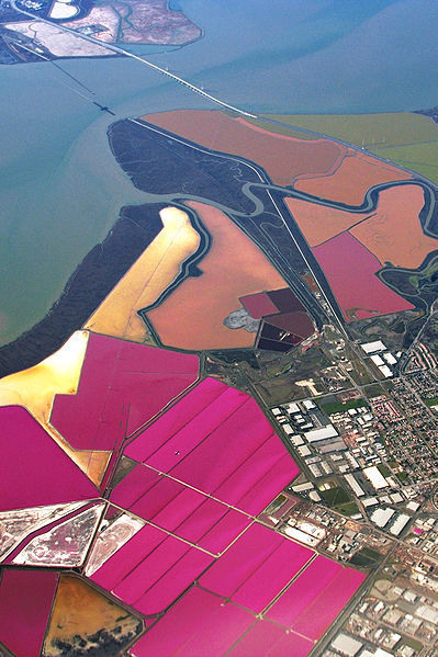
Colourful Plots, Salt Lakes of San Francisco Bay
As the first year of the Journal of the Almost Architect comes to an end and another begins, I have been considering the topics I have most enjoyed, researching and writing about. Although it is hard to pick a favourite, I have discovered the importance of being creative and having fun within the fields of architecture and design. I have tried to discover and interpret works of different scales and types. There have been physical interventions within the public realm that have caught my attention. I have investigated the wonders of both natural and man-made environments. I will continue to share and to discover what I find interesting along my journey as an almost Architect.

Image taken from HTTP://EN.WIKIPEDIA.ORG/WIKI/SALT_EVAPORAT...